

FellowshipOne Insights Dashboards provide visibility into ministry effectiveness by giving you value-driven visualizations of your church’s data – all with an easy to use, modern design. You’ll find key value indicators and useful charts and graphs for your church’s contributions and attendance data, all with the ability to filter to the data that’s relevant to your needs. For example:
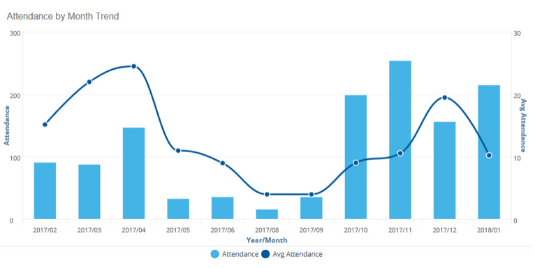
Attendance by Month Trend
This report dashlet is located on the Activity Attendance Overview Dashboard. This shows the total number of people attending activities at the church by month (for the last 12 months), but also the average number of attendants per activity. In this example, it’s key to ask the question, why did the attendance drop beginning May and begin to increase again in October?
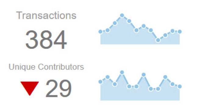
Transactions & Unique Contributors
These Key Performance Indicator (KPI) dashlets are located on the Contributions Overview Dashboard. This shows the number of transactions and unique contributions over the specified range. In this particular example, the downward arrow shows there are 29 less contributors than the previous year.
To learn more about FellowshipOne Insights, click here.