
Our series on our Visualizer Dashboard Contest continues today with our second place dashboard. Our internal contest aimed to find not only the most useful and best looking dashboards, but also how the product could best be used to help churches. The second place award went to Bobby Lester, who has been an account executive with us since June 2016. Bobby talks to churches every day, so he’s acutely aware of the kinds of challenges church leaders face when trying to grow their ministries.
We asked Bobby a few questions about his process in developing this dashboard.
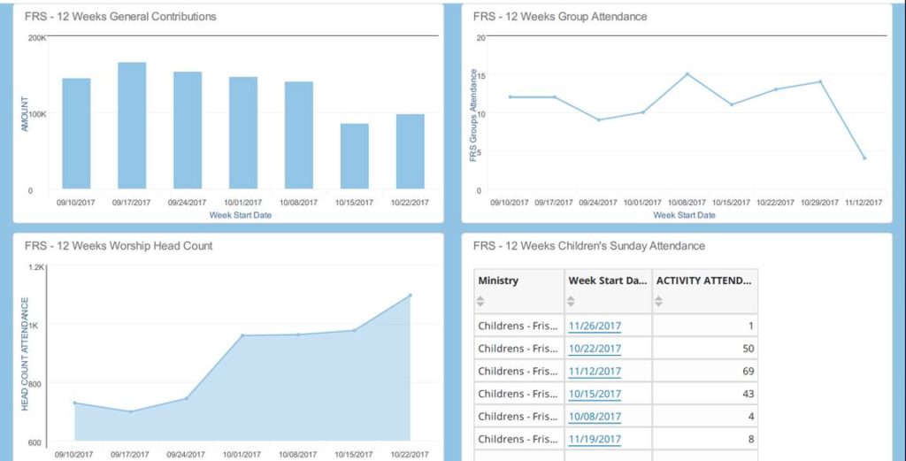
How did you come up with the idea?
BL: I tried to think of the topics a church staff may be discussing regularly; like trying to identify growth and trends. Then I broke down those topics into specific ministry areas. I also wanted to showcase the different types of charts that Visualizer can produce, so each area could be displayed differently.
How easy it was to develop?
BL: Once I learned the basics of creating a chart in Visualizer, it was easy to add additional charts with data from different ministry areas.
Did you hit any snags along the way?
BL: No snags, but I definitely experienced first-hand the importance of maintaining good, clean data! It also re-enforced the mantra, “If it’s not in FellowshipOne it didn’t happen.” Without the data in the system, Insights and Visualizer can’t display your church trends.
Who do you think would most benefit from using this kind of dashboard?
BL: I think church leaders would have this auto-generated and emailed out before weekly staff meetings. It shows a quick snap shot of trends in several key areas in the church. Other areas could be added to the report (for example: 12 week first-time visitor numbers and/or Growth Track class numbers). To view longer trends, easily increase the date range from 12 weeks to 12 months.
Learn more about FellowshipOne Insights and Visualizer here.